CTB LIGHTING
For nearly 10 years, CTB Lighting had been growing within the Perth live events scene. They were technically great, genuinely people first, and were building a strong reputation while making sure everyone had a fun experience. With their sights firmly set on the mid-level touring and events market, they needed a brand that would put them in the spotlight.
Before we touched a design tool, we did what we always do and went deep into who they actually are. And what we discovered was people who were genuinely obsessed with their craft, had playful personalities, and were building things differently in an industry that had seemingly lost sight of the fun that comes from lighting and live events. So instead of the rigid logos and restrained colour palettes that dominate the space, we built them something that felt as energetic, human and real as they are…. with actual stage lighting at the heart of it all.
Before
After
LIGHTING THE WAY, DIFFERENTLY
It was important to CTB Lighting that their identity was simple. It was our job to make sure that simple didn't mean forgettable.
So, we mapped out the competitive landscape by analysing seven Perth based lighting production companies to understand what we were working with. What we found was a pattern that was almost identical across the board that leaned towards dark backgrounds, abstract marks and generic word marks. But the most unbelievable thing that stood out amongst the competitors was that not one of them was using lighting anywhere in their identity. And for a lighting company, this felt like a blinding opportunity.
FINDING THAT SOMETHING SPECIAL
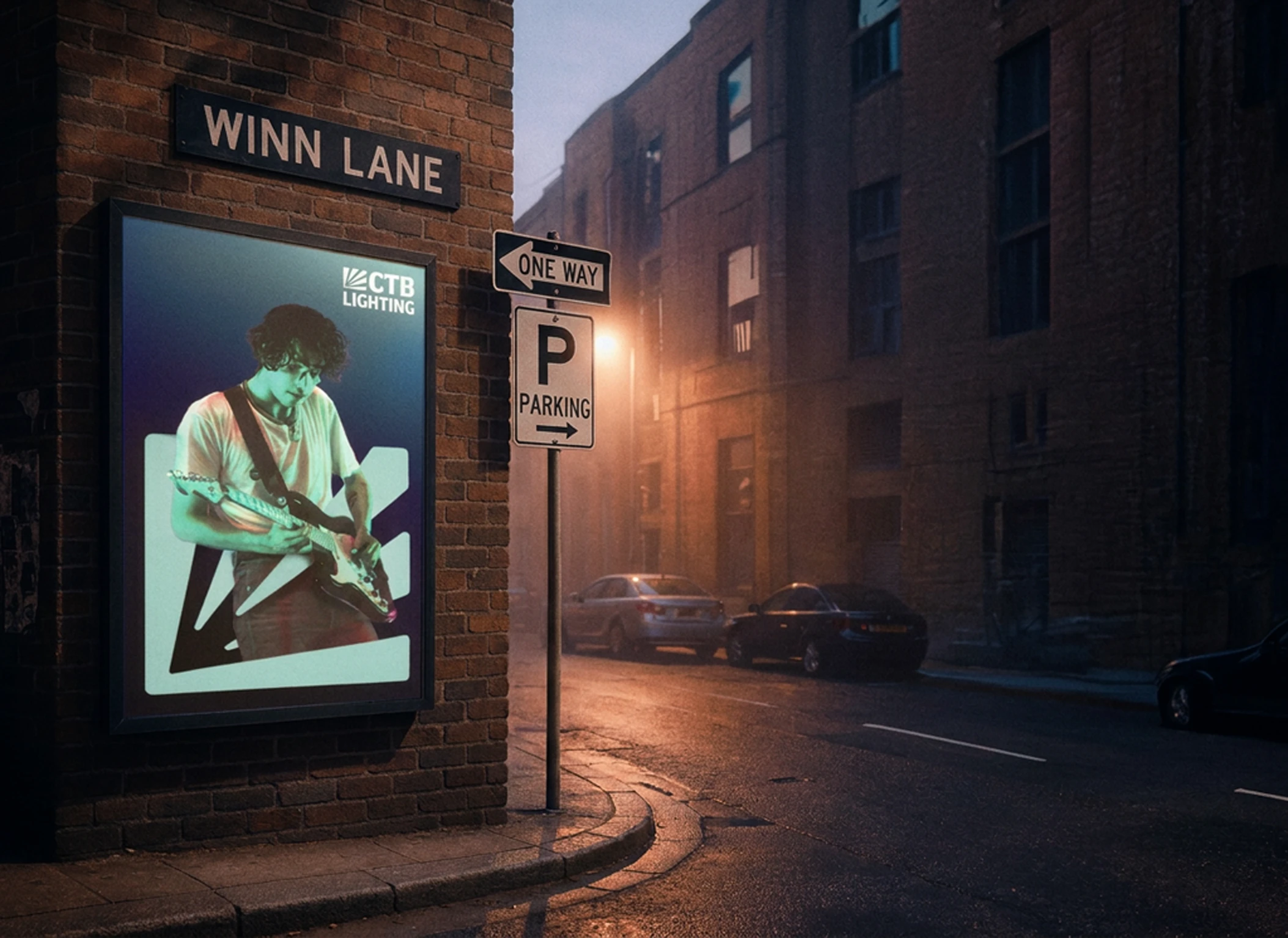
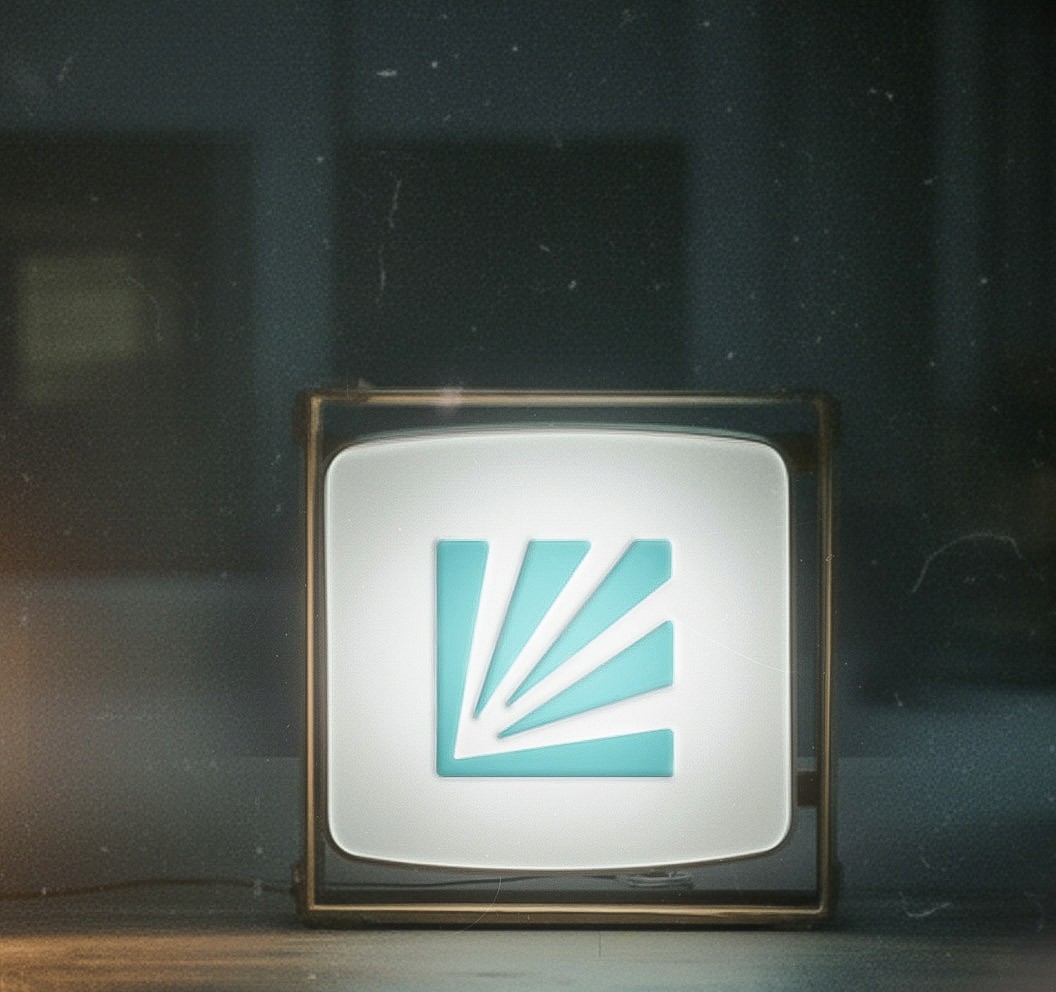
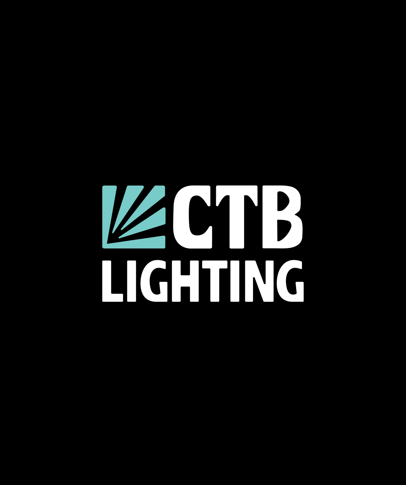
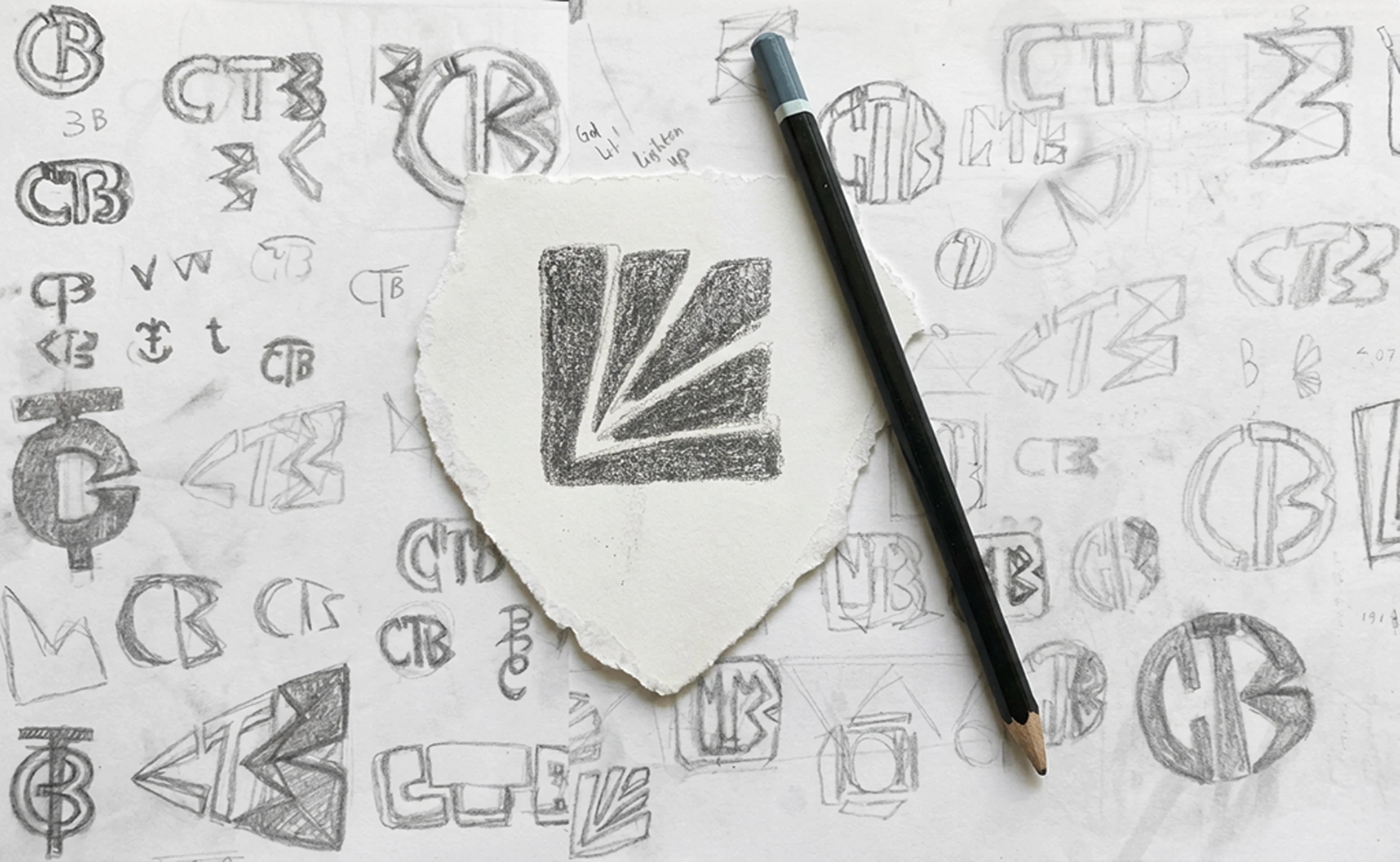
Using the letters CTB, we experimented with stage boxes, light boxes, cables, moving lights and static lights. We found the letter 'B' gave us the most flexibility and space to play with. And by following the way that light travels around it's shape, it lead us to a simple and very striking mark of an upward facing stage light.
The mark started moving from there, and we found ways to make it grow, shrink, move and interact with its environment; adapting in similar ways CTB's light do during their shows. The chunky lines make it bold, while rounded corners give it a friendly, approachable and fun feel.
It's simple, memorable, readable from a distance and puts lighting at the front of centre.

Stage Light Pointing Up
Upward Motion / Positive Vibes
Spotlight
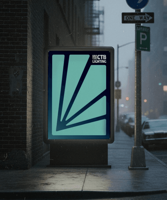
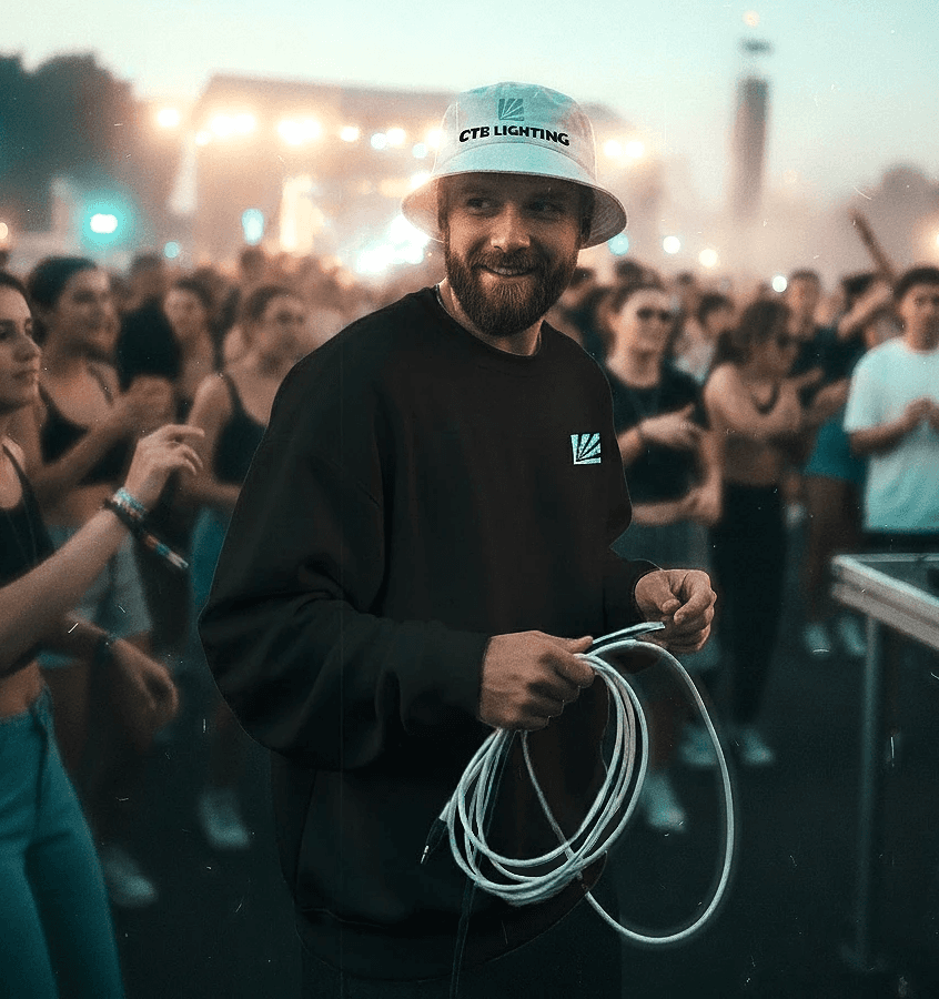
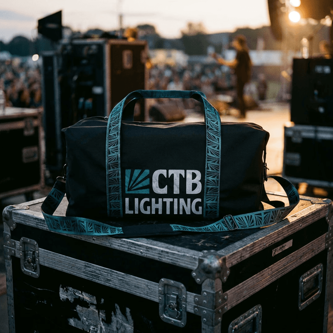
COLOUR ME CYAN
Colour told the same story. Cyan was completely unclaimed across every competitor we looked at. Which felt really insane because in lighting, cyan isn't just a colour, it's one of the three foundational colours of the lighting industry itself, alongside magenta and yellow. It's how every colour of light is mixed and made, so owning cyan was doing more than just looking cool, it was a strategic positioning decision that was both bold enough to make a statement and accurately feel like the people behind it.
We took the time to find the exact shade of cyan to match CTB's energy that was fun and punchy, without tipping into childish or corporate realms. Paired with a deep navy and rich black, there was open space for a gradient that mirrors how light actually moves, which again, for a lighting company, felt like a match made in heaven.
And by creating a custom wordmark, CTB's new logo strikes exactly the right balance to be playful enough to reflect who they are, and professional enough to win them the gigs they're chasing.